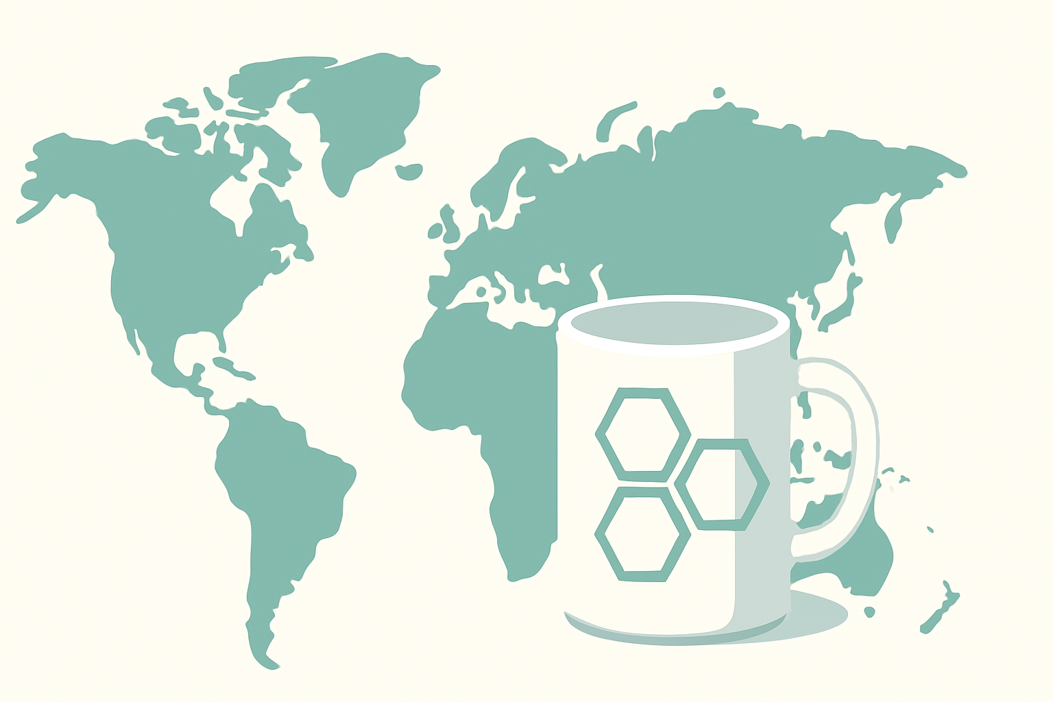
I'm stepping a bit outside the technical area to propose a very interesting topic today – a visual lesson about the mistaken perception of the size of countries on the maps we all saw at school. An interactive site shows us how misleading traditional maps can be and how we can discover the true proportion of the world we live in.
Have you ever wondered how big Russia really is compared to Africa? Or Greenland compared to India?
The answer might surprise you – and that is exactly what the site TheTrueSize.com aims to correct: to show you the real size of countries around the globe, without the distortions imposed by classic map projections.
🧠 Why do we have a mistaken perception of the size of countries?
Most of the maps we see (including those in schools) use the Mercator projection, created in 1569 for maritime navigation. The problem?
This projection distorts proportions – especially as we approach the poles. Northern countries like Canada, Russia, and Greenland appear much larger than they really are.
👉 For example:
-
Greenland seems almost as big as Africa, but in reality, Africa is 14 times larger!
-
Russia visually dominates the map, but it is smaller than Africa and almost equal to South America.
🌍 What does TheTrueSize.com do?
It is an interactive web application that allows you to:
-
Drag and move countries anywhere on the globe.
-
See how their real size changes depending on latitude.
-
Easily compare territories: move Romania over Germany, Brazil over the USA, or China over Africa and see the reality with your own eyes.
📌 Quick example: Romania vs. Japan
At first glance, Japan seems much larger. But if you drag Japan over Central Europe, you will see that the two countries are much closer in area than you imagined.
🧪 What do we learn from this?
-
Spatial perception is influenced by presentation, not just by numbers.
-
Interactive tools can change the way we learn geography – more visually, more engaging.
-
Context matters: if you place an equatorial country next to a polar one, you see how the classic distortions visually “inflate.”
🧩 Useful for teachers, curious people, journalists, or developers
TheTrueSize.com is not just an entertainment tool:
-
Teachers can use it for interactive geography lessons.
-
Journalists can include it in articles for a more balanced representation of the world.
-
Developers can learn about the limitations of cartographic projections and simple WebGL applications.
🔍 Conclusion
TheTrueSize.com shows us a simple but profound reality: the way we see the world depends on the lenses through which we interpret it.
And in the case of maps – that “lens” is called projection, and it has fooled us for quite some time.
🔗 Direct link: