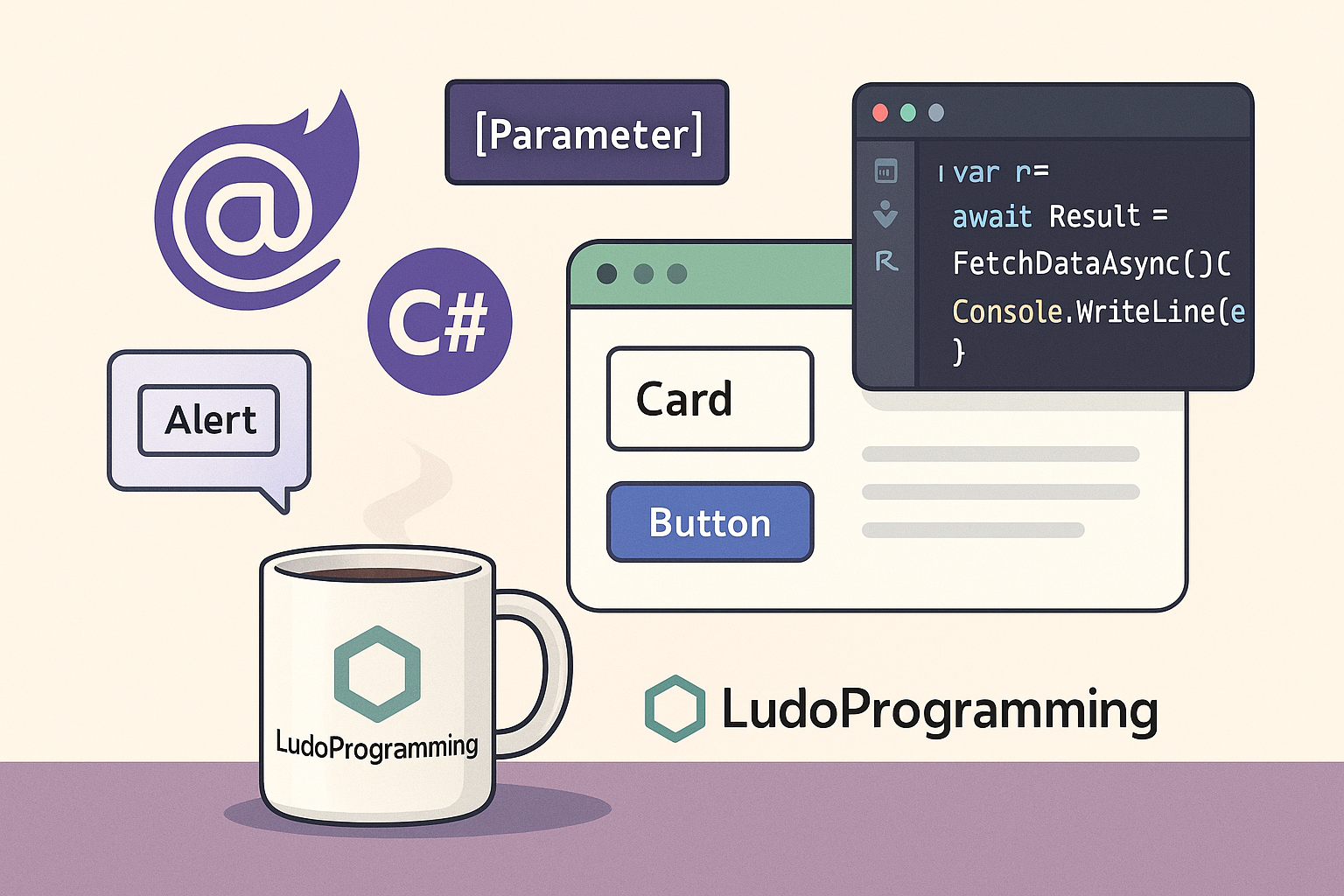
In Blazor, components are the basic elements for organizing and reusing UI code. A component is a .razor file that can contain HTML, C#, and other components. They make the application more modular, easier to maintain, and more scalable.
🔧 How do we define a component in Blazor?
We create a new .razor file – for example, CardComponent.razor – and populate it with markup and logic:
<div class="card">
<h3>@Title</h3>
<p>@Content</p>
</div>
@code {
[Parameter]
public string Title { get; set; }
[Parameter]
public string Content { get; set; }
}
📥 What are [Parameter]?
The [Parameter] attributes allow components to receive data from outside (i.e., from other components/pages that use them).
▶️ How do we use a component?
After you have defined the component, you can simply use it anywhere in the application:
<CardComponent Title="Hello!" Content="This is a reusable component." />
You can create multiple instances, each with its own data.
💡 Alternative example: AlertComponent
<div class="alert @CssClass">
@Text
</div>
@code {
[Parameter] public string Text { get; set; }
[Parameter] public string CssClass { get; set; } = "alert-info";
}
Usage:
<AlertComponent Text="Operation successful!" CssClass="alert-success" />
<AlertComponent Text="Processing error." CssClass="alert-danger" />
🧠 Conclusion
Components offer you an elegant way to reuse and organize the interface. Through [Parameter], you can create flexible and customizable elements. In the next article, we will see how to manage data between components (EventCallback & state lifting).