Many entrepreneurs believe they need a "complex" website to get results.
The truth?
A simple website can bring more clients than a sophisticated one, if it is built correctly.
The problem is not how big the website is. The problem is whether it is clear and convincing.
🎯 1. A clear message, at the top of the page
Within the first 5 seconds, the visitor must understand:
-
What you do
-
For whom
-
What problem you solve
No vague slogans. No complicated texts.
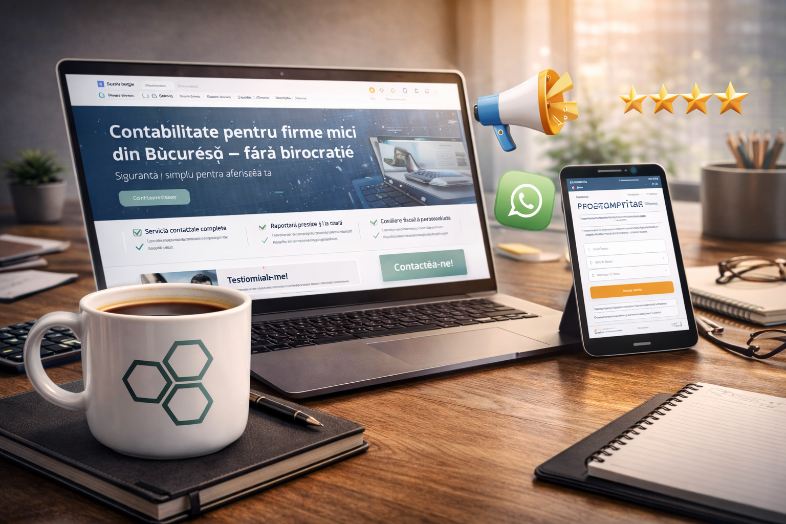
Good example: "Accounting for small businesses in Bucharest – without bureaucracy."
Weak example: "Innovative solutions for your future."
📌 2. Services explained simply
No long paragraphs. No technical terms. Explain:
-
What you offer
-
What the client receives
-
How it helps them concretely
People buy results, not sophisticated descriptions.
⭐ 3. Proof of trust
A website without proof is just a promise.
Add:
-
testimonials
-
reviews
-
case studies
-
portfolio
-
real photos
Trust is the currency online.
📞 4. Clear way to contact
If someone is convinced, they must be able to:
-
call quickly
-
send a form
-
write on WhatsApp
-
schedule a meeting
The contact button must be visible. Not hidden in the footer.
📱 5. Mobile-friendly
Most visitors come from phones.
If:
-
the text is hard to read
-
the buttons are small
-
the site moves slowly
you will lose clients without knowing it.
⚡ 6. Speed and simplicity
A simple, fast, airy website works better than a loaded one.
Fewer pages. More clarity.
Common mistake
Many invest in:
-
animations
-
complicated design
-
useless pages
But forget about:
-
message
-
structure
-
conversion
The website doesn’t have to impress designers. It has to convince clients.
Conclusion
A simple website that brings clients contains:
✔️ clear message
✔️ services explained concretely
✔️ proof of trust
✔️ easy contact
✔️ optimized mobile version
That’s it.
Complexity doesn’t sell. Clarity sells.